How I redesigned the core product of a tax platform with 15,000 users
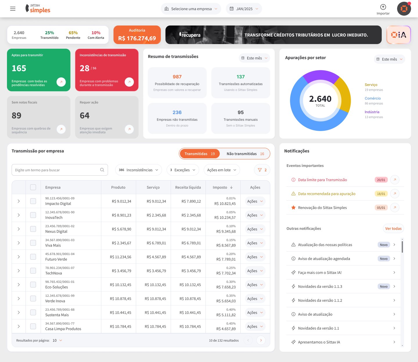
I redefined the whole experience of Sittax Simples, a tool that automates tax calculation for small businesses under Brazil's Simples Nacional regime.
- Role
- Senior UX Designer
- Company
- Sittax
- Period
- 2024 to present
- Team
- Design, product and engineering
- 255khours of work saved by Sittax customers in 2025
- R$504Min improper taxes avoided by Sittax customers in 2025
- 6,000active customer firms on the platform
- 15,000users on the platform
Context
Sittax Simples is Sittax’s main product. It automates tax calculation, a task accounting firms do every month, for many clients at once and against legal deadlines. The people using it are accountants and their teams: they know the tax rules in depth and have no time to lose with the interface.
I was responsible for the product’s UX and UI, from research to delivery, working directly with the business teams.
The problem
The biggest pain in tax calculation has always come down to three things: seeing the data clearly, checking the numbers and trusting the result before filing. To get there, accountants relied on a large number of spreadsheets to gather invoices and calculate taxes.
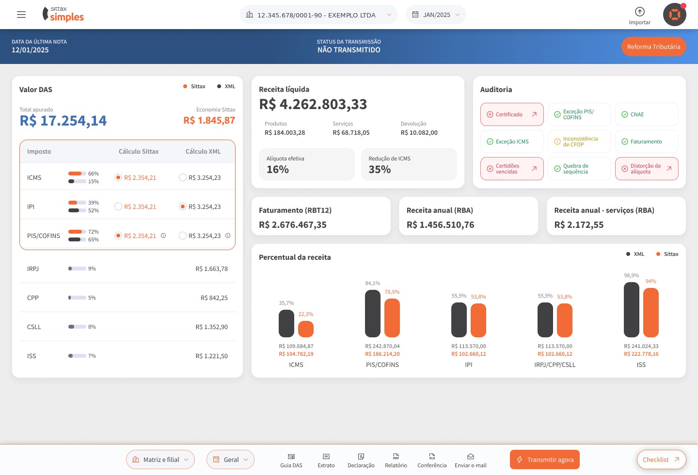
The goal of the redesign was to take that work out of spreadsheets. The product now fetches and calculates invoices automatically, suggests adjustments when something doesn’t match, and lets accountants issue the payment slip and file the return in one click.
What I did
- Ran user research: interviews, discovery sessions, data analysis and usability tests with clickable prototypes.
- Reorganized the information architecture: navigation, search, labeling and the product’s interface patterns.
- Redesigned the flows and interface, built on the design system I created for the company’s 6 products.
- Introduced the functional specification document (FSD) as the standard for documenting screens, produced with Claude, Figma and Notion, to make handoff to engineering and QA easier.
Decisions and trade-offs
The hardest decision was convincing stakeholders that, in this product, showing less is better. Instead of putting every piece of data on screen, I kept each screen lean and focused on what actually helps accountants make decisions.
That was the constant work across the whole product: when there was too much information, I split the flow into steps that follow the user’s mental model, so they could read and analyze the data more clearly.
Results
The redesign spanned the period in which Sittax grew from 1,000 to 6,000 customer firms. In 2025, the year the new Sittax Simples main dashboard launched, I contributed to a platform that saved customers 255,000 hours of work and avoided R$504 million in improper taxes, according to Sittax.
In 2026, tax calculation, the core step of the product, got an improved version built on the same approach.
What I’d do differently
I would negotiate more time for discovery. A considerable share of the effort went into changing the final prototypes based on user testing, and some of those changes could have been caught earlier with deeper research at the start.